The Margin Doodle
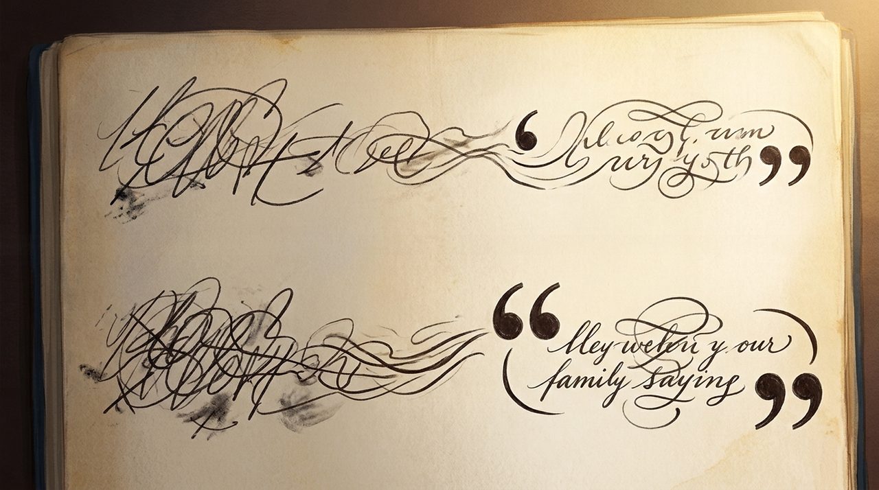
The quotation mark did not start as a mark for quotations. In fifteenth-century manuscripts, someone drew a small double mark out in the margin, and it had nothing to do with speech. It sat there to flag a passage worth remembering, a line the reader was meant to slow down and notice.
So how did a doodle that just meant pay attention here become the universal sign for someone said this? The trail runs from monks copying books by candlelight all the way to bird tracks in fresh snow, and hidden inside it is a shape you have stared at your entire life without ever really seeing it. This is FactCat, meet the quotation mark.
The Spotlight In The Margin
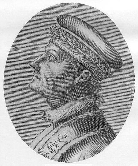
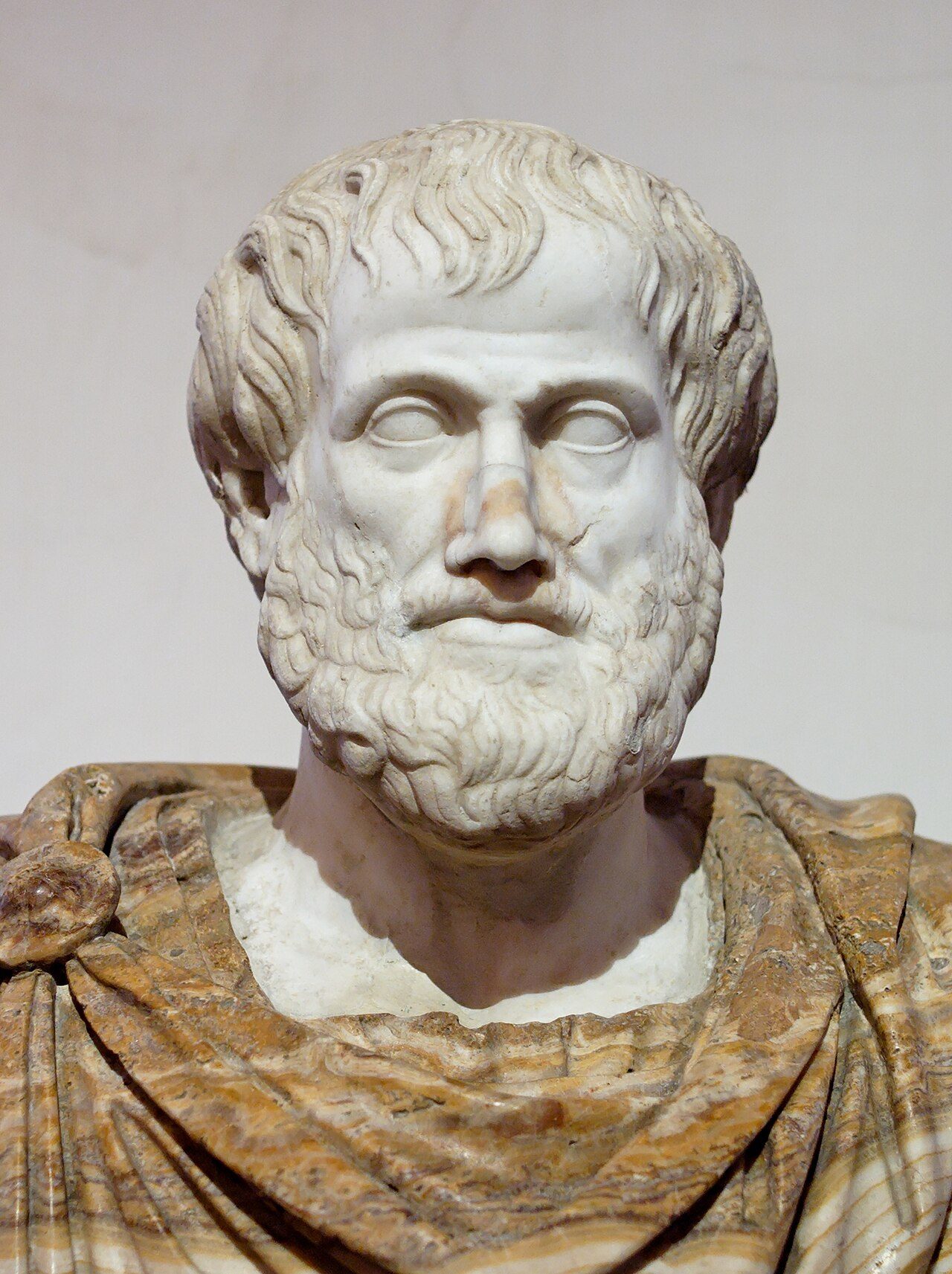
The oldest clear fingerprints on this belong to a scholar named Francesco Filelfo, a humanist working in Milan. Around fourteen-eighty-three he published a fresh edition of the philosopher Aristotle, and next to the important quotes he inked a pair of slanted double dashes down the left margin. Not once at the top of the passage.
Beside every single line of it, running all the way to the bottom. Picture a whole paragraph with a little ladder of marks climbing down its edge, each rung quietly insisting this part matters. Filelfo was not inventing a symbol for speech at all.
He was building a spotlight, one line at a time, and that spotlight is the ancestor of the modern double quotation mark.
The Greek Chevron
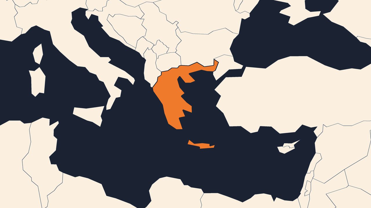
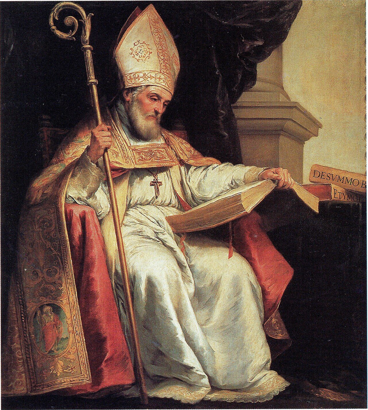
But there is an even older thread here, and it belongs to the single quotation mark. That one traces all the way back to Ancient Greek writing, borrowed and reshaped by the monks who copied manuscripts by hand. Back in the seventh century, the scholar Isidore of Seville wrote down the tool they used: the Greek diple, a small chevron shaped like the tip of an arrow, aimed at a line worth calling out.
Same instinct as Filelfo, look here, except a full thousand years earlier. That little arrow is why, for centuries, calling attention to a line and quoting a line were basically the same gesture. And when the single mark resurfaced around eighteen-hundred, it came back with a brand new job: marking a quote tucked inside another quote, a second voice nested neatly within the first.
That nesting rule still trips people up today, because once you drop a quote inside a quote inside a quote, the marks have to keep alternating, single, double, single, all the way down, a little set of Russian dolls made of punctuation.
Out Of The Margin
For a long stretch the mark lived a double life. Through the sixteen-hundreds the habit narrowed, and the marginal note became tied specifically to quoted material. In Britain especially, printers began stamping quotation marks at the start and the end of a quote, while still repeating them down the margin as well, belt and suspenders.
Then, in the final years of the seventeen-hundreds, the margin marks quietly disappeared. What survived was the tidy little pair we use now, hugging the quote at the level of the lowercase letters. Later, the two sides of the Atlantic even split on the details.
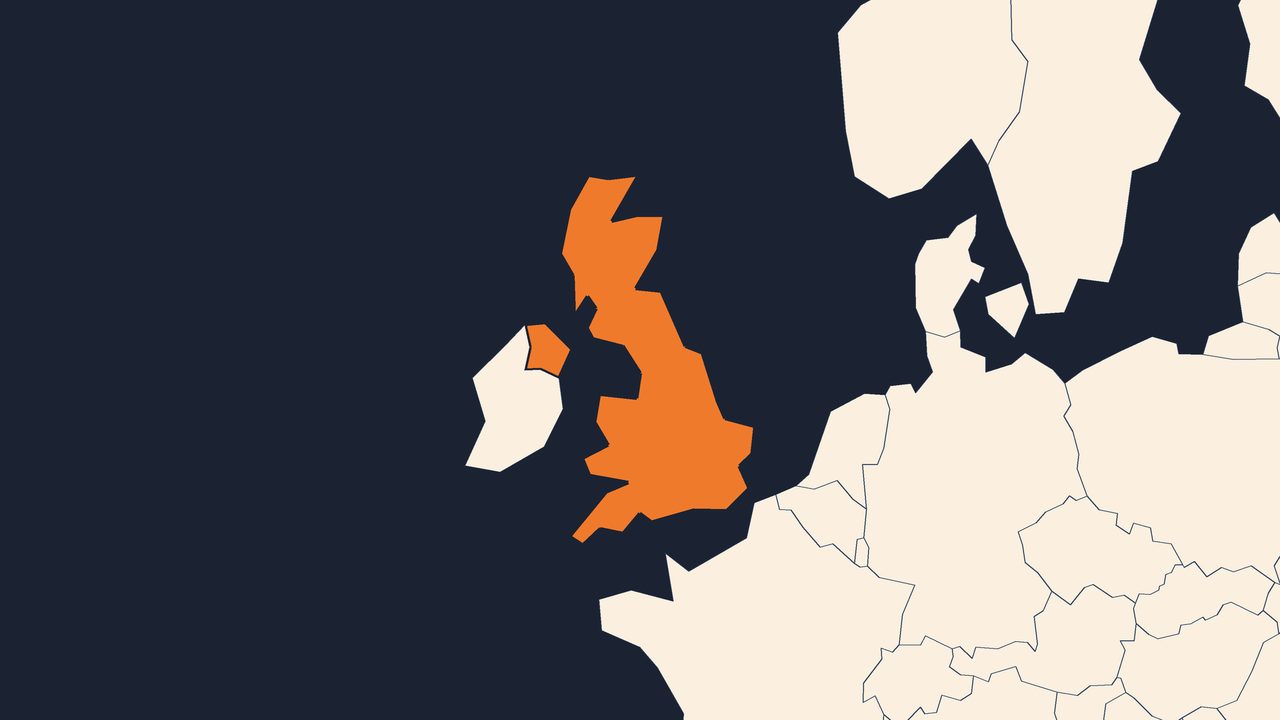
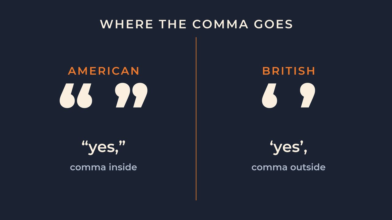
American printing settled on the double mark as its default, while British publishing stayed looser, drifting toward the single mark after the mid-nineteenth century, when steam-powered presses turned London and New York into rival publishing capitals with their own house rules. They fell out over things as tiny as a comma: North American printing tucks periods and commas inside the closing mark, whether or not they belonged to the original quote, while other styles leave them outside and insist that is the more logical way. By the time The King's English was written in nineteen-oh-eight, the standard British move was doubles for most quotes and singles for a quote inside a quote.
Straight Versus Curly
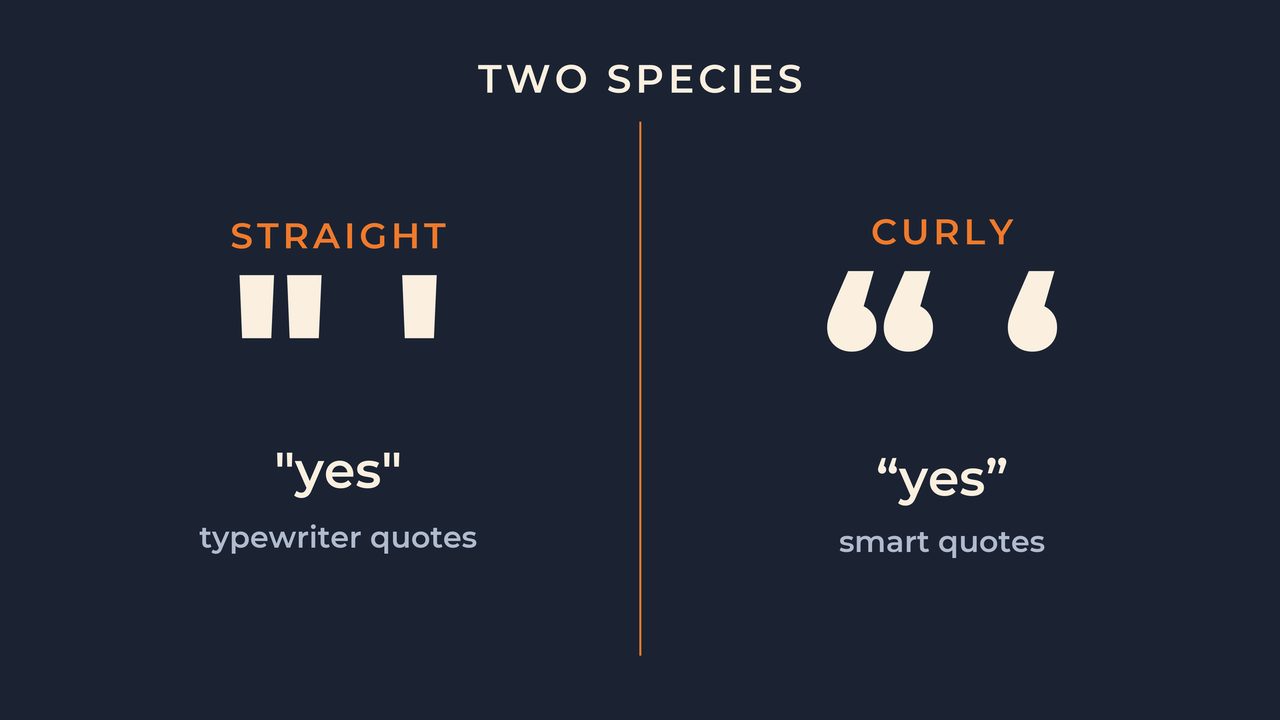
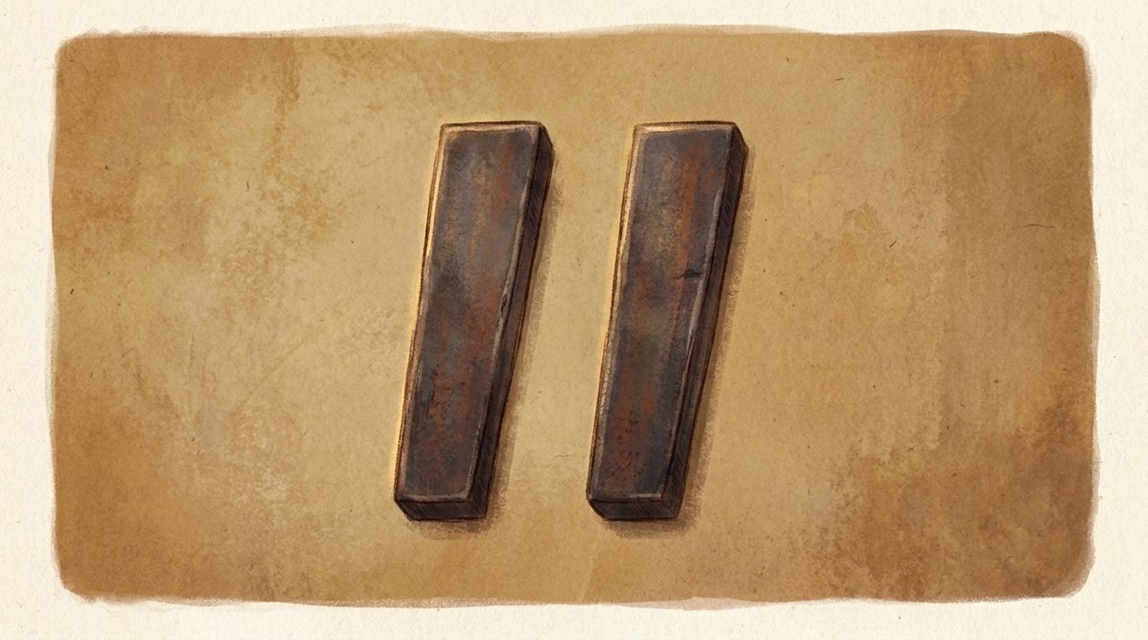
Now look at the marks themselves, because they secretly come in two very different species. The ones on your keyboard are the straight, vertical kind, where the left and the right are identical, blunt little tally marks. Typographers have unkind names for those: dumb quotes, typewriter quotes, ASCII quotes.
Then there are the curly ones, the elegant curved marks you see in printed books, also called smart quotes. Most computers quietly try to swap the straight ones for the curly ones as you type, and every so often they get it charmingly wrong. These marks also pull a sneakier trick.
Wrap them around a word you do not actually mean, and they flip its sense into so-called, the printed version of rolling your eyes. And they have secret twins on top of that. The closing single curly mark is shaped exactly like an apostrophe.
The double one is identical to the ditto mark, the symbol that means same as the line above. One tiny curl, doing several completely separate jobs depending on where it lands.
The Hidden Shape: Sixty-Six And Ninety-Nine
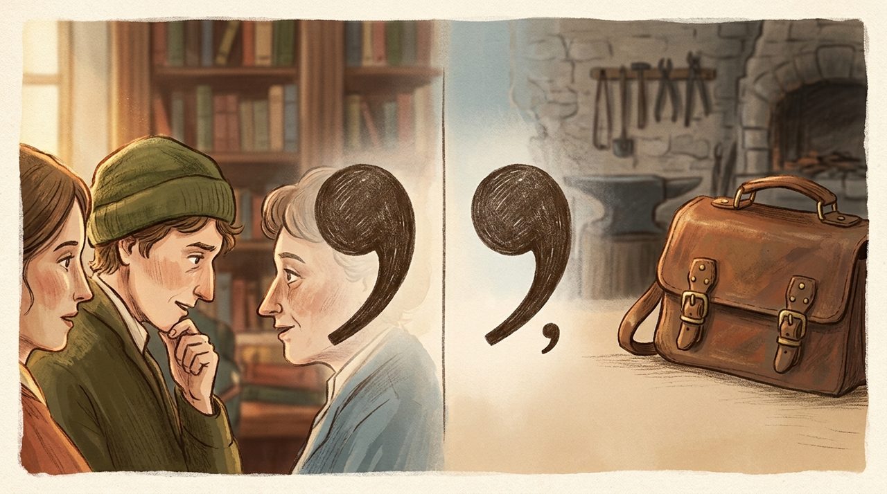
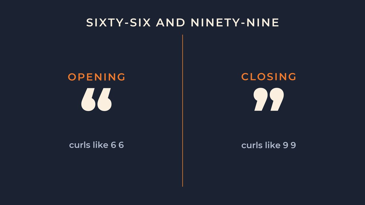
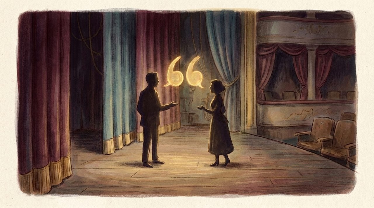
Here is that shape I promised you, the one hiding in plain sight. Take a close look at a pair of curly double quotation marks. The opening marks are two commas lifted to the top of the line and spun around.
The closing marks are two commas raised straight up to that same height. And typographers have a quiet little nickname for them, based purely on what they look like: sixty-six and ninety-nine. The opening pair curls exactly like the digits six-six.
The closing pair curls exactly like nine-nine. Once someone points it out, you genuinely cannot switch it off, and from now on every quote you read is bracketed by a tiny sixty-six on the left and a tiny ninety-nine on the right, forever.
A Different Mark In Every Country
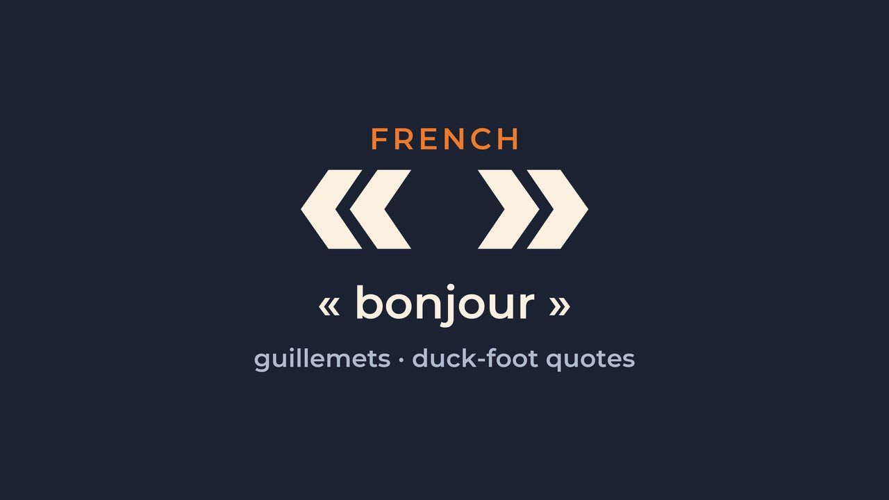
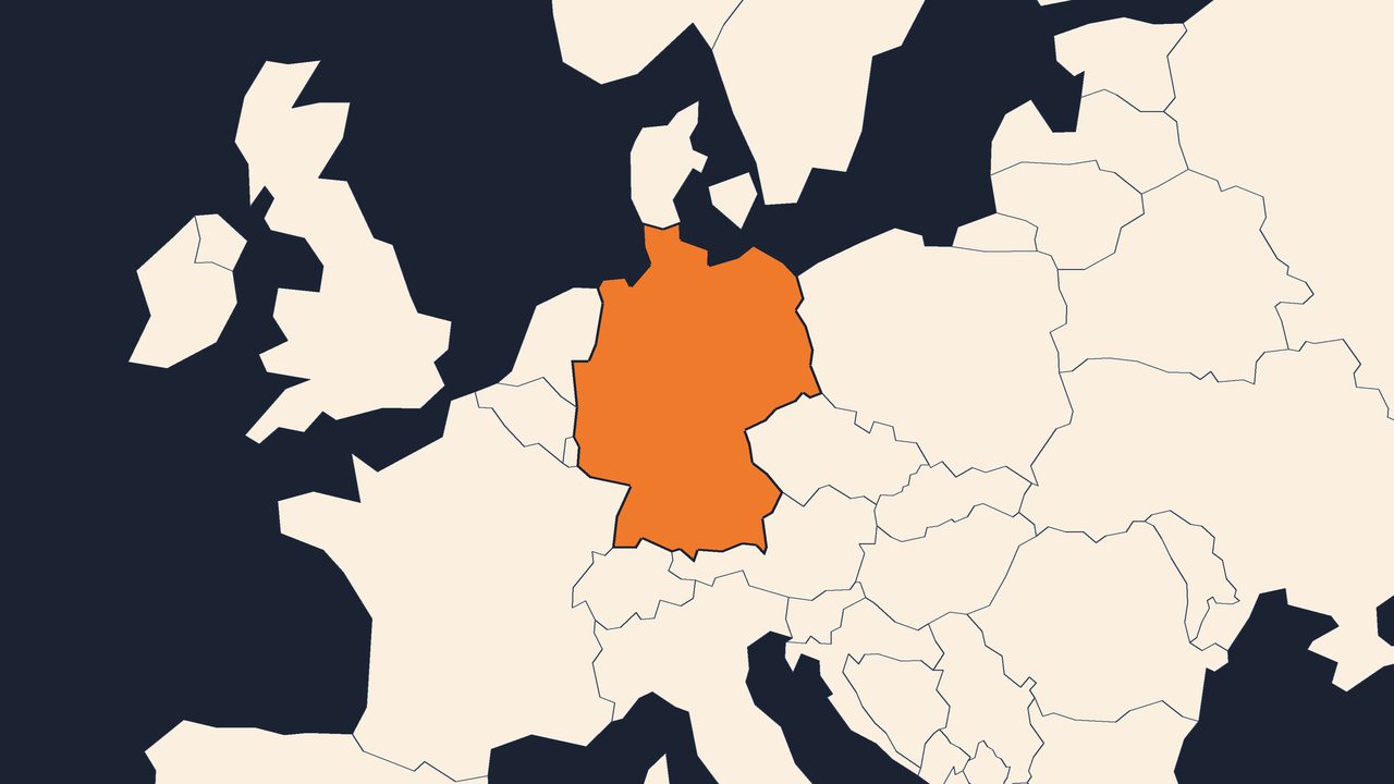
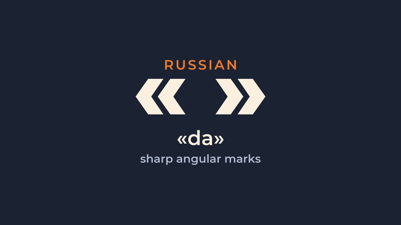
And once the mark left the margin, the world stopped agreeing on what it should even look like. French writers use sharp little arrowheads called guillemets, nicknamed duck-foot quotes, with a thin sliver of space tucked inside them. German printers do something that looks upside-down to English eyes: the opening mark drops to the bottom of the line as a low double comma, so the quote seems to start on the floor and finish up in the air.
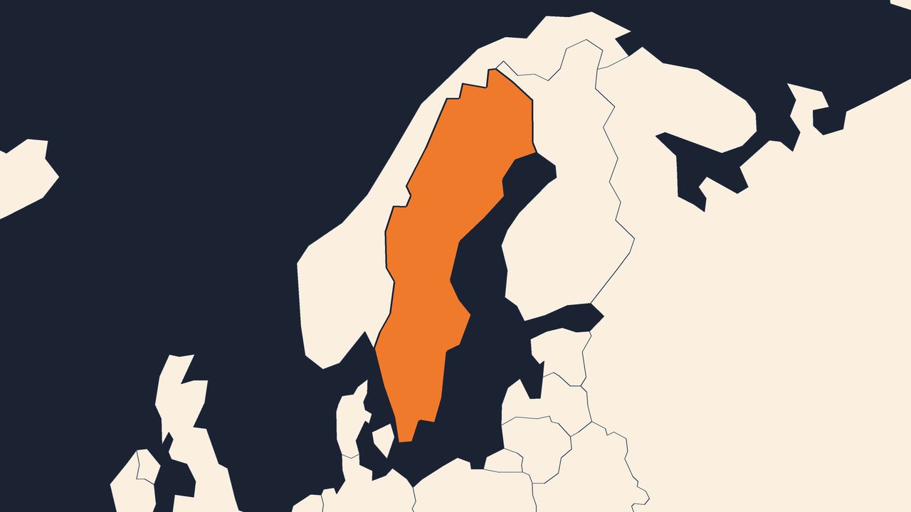
Across Central Europe the marks were often turned to point their curves inward, like two little hands cupping the words. In Sweden and Finland both marks lean the same way, to the right. Over in Russia, Ukraine and Belarus, the printed page leans on the sharp angular marks as its main quote, while the soft curved pair gets bumped down to handwriting and to quotes buried inside other quotes.
Some places barely trust the marks with speech at all: in Bulgarian prose, a dash at the start of a line often opens direct speech instead. The marks even jumped off the page entirely, into those finger-wiggle air quotes people throw in conversation, the same two curls drawn in the space between two faces. Even the plain English name refuses to settle down, since the very same marks get called quotation marks, quotes, speech marks, and inverted commas depending on who you ask.
Every culture took the same two specks of ink and reshaped them in its own image.
Goose Feet, Little Paws, And Back To The Margin
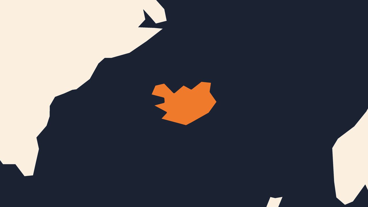
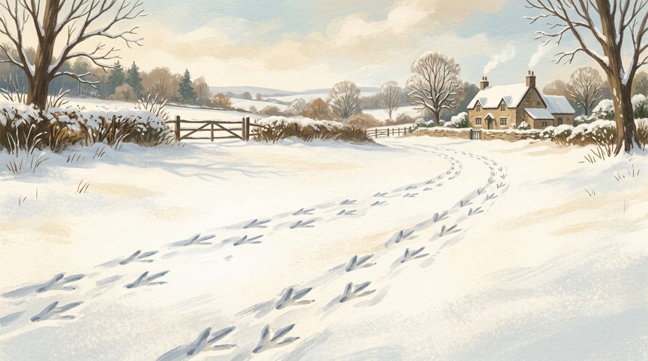
Which brings us to the best part: the names. In Iceland, quotation marks are called goose feet, because the angled marks look just like the tracks a goose leaves walking across fresh snow. Sit with that for a second.
A whole country reads a printed quote and literally pictures bird prints in the snow. And that name is no museum piece; goose feet is simply what those angled marks are called. In Poland, they are not called marks at all.
They are called someone else's word, punctuation named straight after the idea it carries, that these words belong to somebody else. And in Ukraine, the very same marks go by little paws, tiny animal tracks pressed into the page. Goose feet, little paws, someone else's word, three languages looking at three tiny poems, all describing the exact same specks of ink.
So the next time you drop a quote into a sentence and reach for those two small marks, remember what they used to be. Not a sign for speech, but a note a scribe scratched into the margin to say this line matters, this one, right here. Six centuries later that same little flag has folded onto the lowercase line, split into a six-six and a nine-nine, and picked up names like goose feet and little paws along the way.
It never really was about quotations. It was always about one quiet instruction: look here. Mind the margins.
FactCat, out.